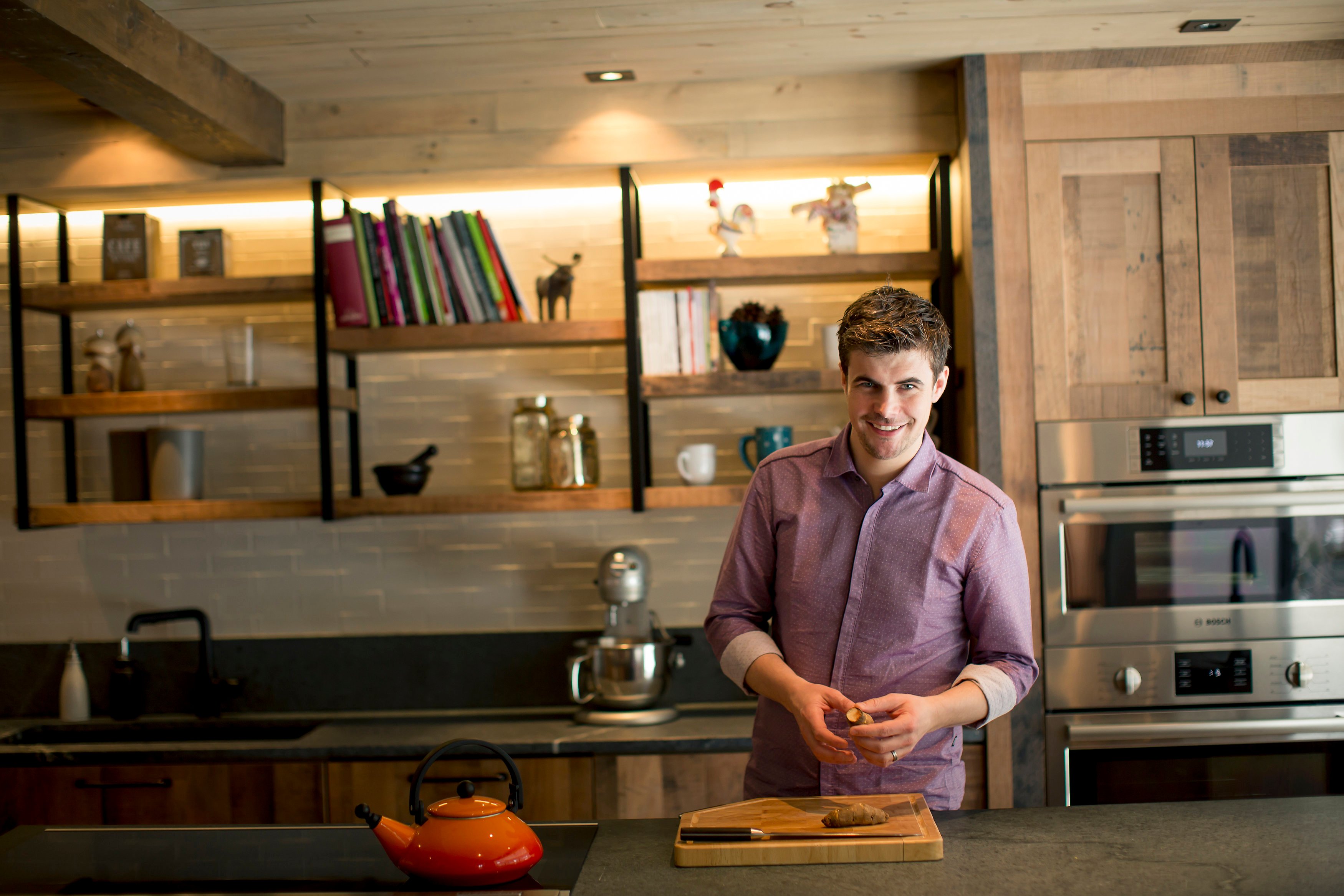
When Chef Arnaud Marchand set out to build a home kitchen for his young family, I knew he had a clear vision for his design. His kitchen - from the ceiling beams to the floor tiles – needed to be warm, functional, dynamic and beautiful – and resonate with the scenic environment – and be great for the camera.
Marchand is chef and co-owner at Chez Boulay, a Nordic restaurant in Quebec. He is also shooting an upcoming online cooking show.
A challenge for designer Isabelle Cyr of Cyr Cathcart, but it was a combination of the home’s setting in the woods of Quebec and the couple’s love of natural wood that set the rustic (but not country) tone for her total remodel.
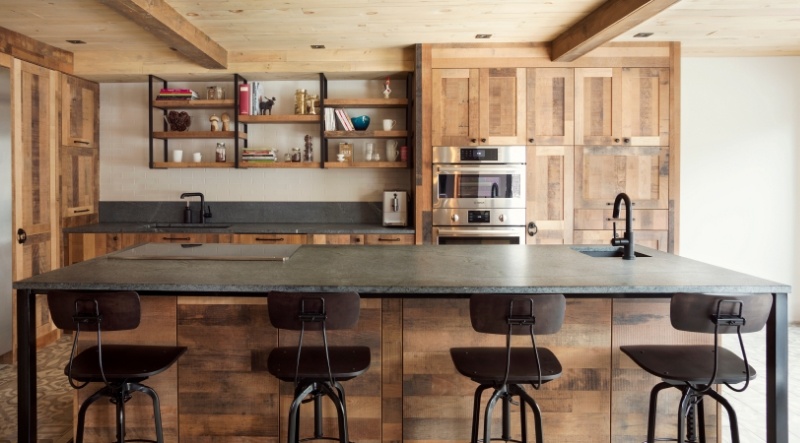
It’s one of my favorite installations, especially for the grand use of soapstone and the overall chic look that Cyr designed. Here’s what she told me about the project:
“When I met with Arnaud and his wife Sophie they had two big demands: make it useful for Arnaud as a chef, of course, and for him to shoot his cooking shows; and to keep the spirit of the home. It’s an older house with wood everywhere and they were in love with that kind of design. That’s what they wanted to continue in the kitchen.”
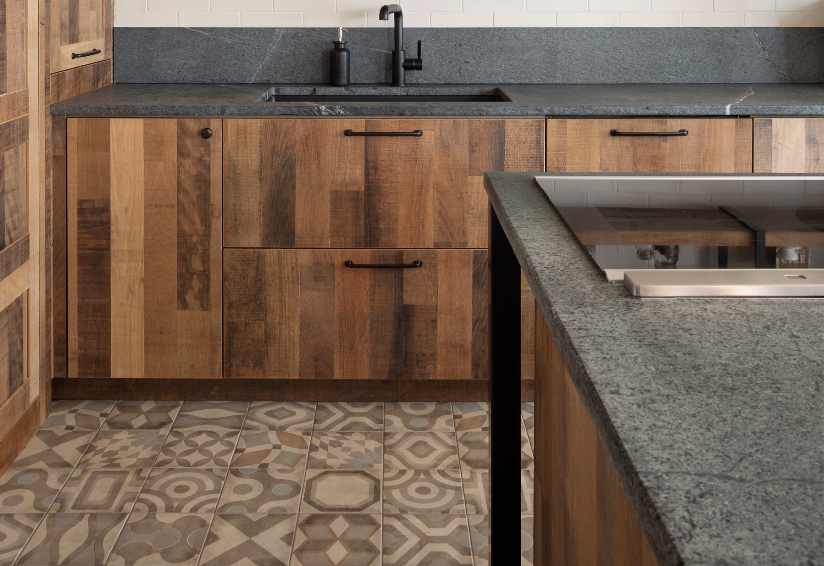
For use as a video set Cyr had to consider background, lighting, where the camera could go, how the surfaces appear on camera – and how to keep it functional for a family with two little kids.
(I can tell you as a fan of Chef Marchand, he’s so passionate about his art of cooking. He talks about his recipe and I’m starving!)
Naturally it was the chef who had the most to say about the look and feel of his kitchen. “A feeling of warmth in my kitchen is important to me, Marchand said, “but when I’m in my kitchen I want it to be like I’m in a professional kitchen.”
For a professional used to a hard wearing industrial kitchen, Marchand made some surprising choices for natural materials. “I wanted woods that looked old and weathered to seem like they had been there for a long time,” he said.
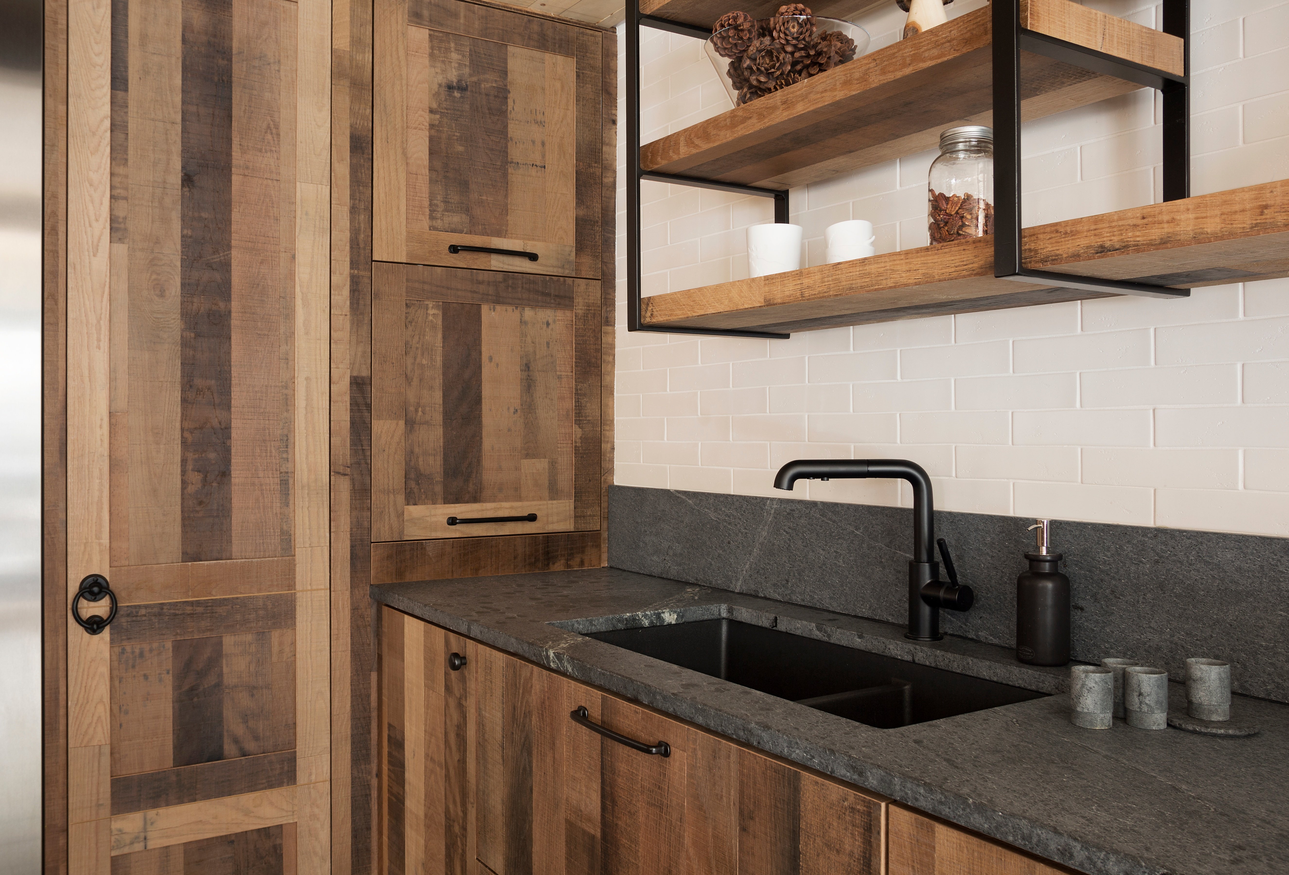
First, for his cabinetry Marchand wanted reclaimed barnwood but Cyr said, “That was too old for me. I wanted something more chic.”
When she discovered the warm weathered look of a hickory veneer product from Goodfellow she said it was the perfect compromise between classic wood and barnwood cabinets. “It’s really rich, a lot of colors, a lot of texture.” And unlike some spaces heavy on reclaimed wood, “It’s not going to be a ‘2015 kitchen’.” The chef agreed and they had Simard Cuisine et Salle de bain clad all the custom cabinets and the island in the product.
The expansive workhorse island with an induction cooktop and prep sink make it a set ideal for cooking on camera and the surface, an extra large slab of honed ALBERENE SOAPSTONE™ with white veining was both a practical and aesthetic choice. See more soapstone kitchens here.
Marchand wanted a strong surface that could handle a hot cast iron pot, but at the same time he didn’t want a uniform engineered surface.
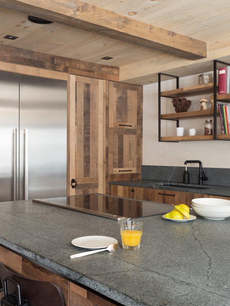
Cyr directed the chef to soapstone because she knew the couple wanted a natural material that ages like wood, with character and patina. It also fit Marchand’s request for a product that was alive and would grow with his family. (Plus the texture, it feels silky like baby powder.)
“When the fabricator at Atelier Bussière showed the stone to me he said, ‘Make sure the client knows it will wear over time.’ I knew that the couple would love that,” Cry said.
And she was right. The natural variations were just what the chef wanted, and one reason he left his untreated.
“We have a story in the stone. The slab is not the same on the right side as it is on the left. It’s a big slab with big veining. I love that. It’s unique,” Marchand said. “Yes it gets marks, but I love them. It’s the story of my house, of my children. I have two children, 2 and 4 years old. I love to cook with them. On my soapstone I can put a hot pot down and not have to worry.”
To learn more about how soapstone wears over time read this post.
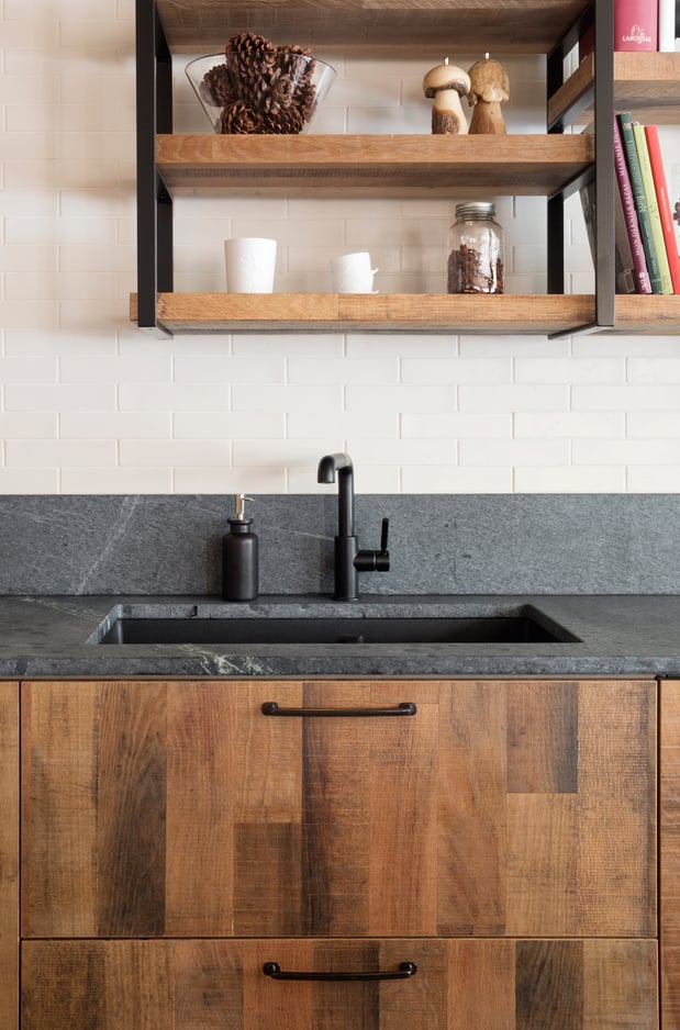
An unexpected perk was how the untreated blue-grey stone looks on camera, Cyr said. “It’s such a nice background for television. You put a plate on it and it’s so rich.”
The whole look of the kitchen from the wood ceiling and rough hewn beams to the artistic tile floor has an old world European feel. Her goal, she said, was to make it look as though the kitchen had always been there.
Cyr kept the rustic look of the project from careening off a dirt road into “country” with straight lines, black accents and industrial finishes. I like to call it urban rustic. The black metal supports for the island and open shelves were custom built. The cabinet hardware is iron with a soft finish that feels like it was handcrafted generations ago.
“We achieved a result that looks like them and is the way they live. With the big island everyone can be in the kitchen together,” Cyr said. Which is perfect for this family, because as their designer said, “They’re two warm, welcoming people and we wanted to have that feeling in the kitchen.”
I'd love to share all the design resources with you, including the gorgeous artistic floor tile and weathered iron hardware. You can get those specs and more in the design board here.
Photo of Chef Marchand by Jonathan Robert
