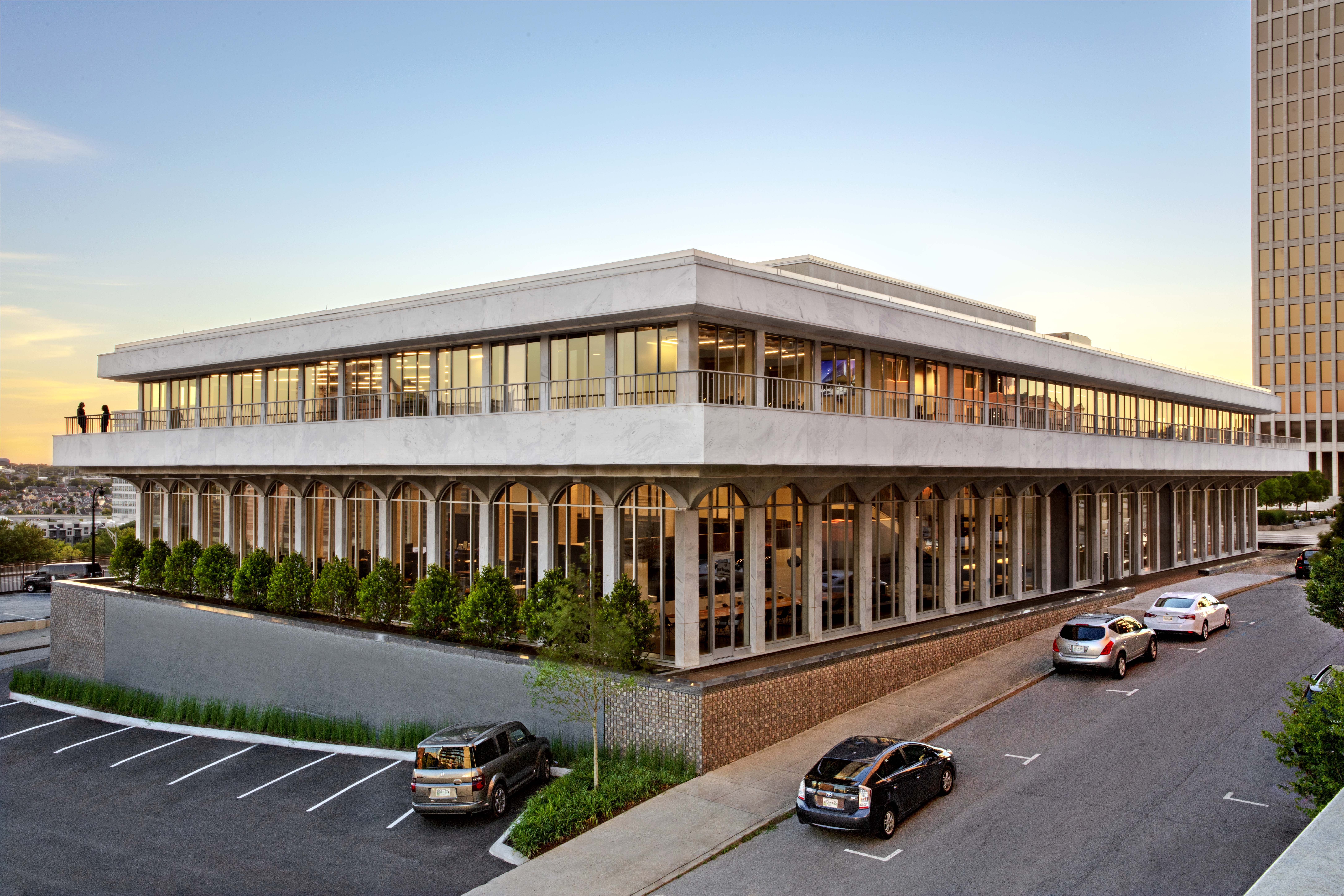
For several years, Nashville’s thriving economy has led to an endless reshaping of the city’s skyline. High-rise residential towers and 25-story office buildings dot the sky—alongside omnipresent construction cranes. While many of these new builds went up in parking lots, that was not always the case.
“Nashville went through a pretty long season of not doing a good job saving those older buildings,” said Dave Powell, a partner in HASTINGS Architecture, one of the city’s best-known firms. “I don't know that any city really has a stellar record for that. Which is unfortunate.”
But Powell and his colleagues are invested, quite literally, in saving some of Nashville’s history, having recently completed the redesign of the former Nashville Public Library as the firm's new headquarters. Now known as 225 Polk, this adaptive reuse project has given the city's iconic and beloved library new life as a creative workspace.
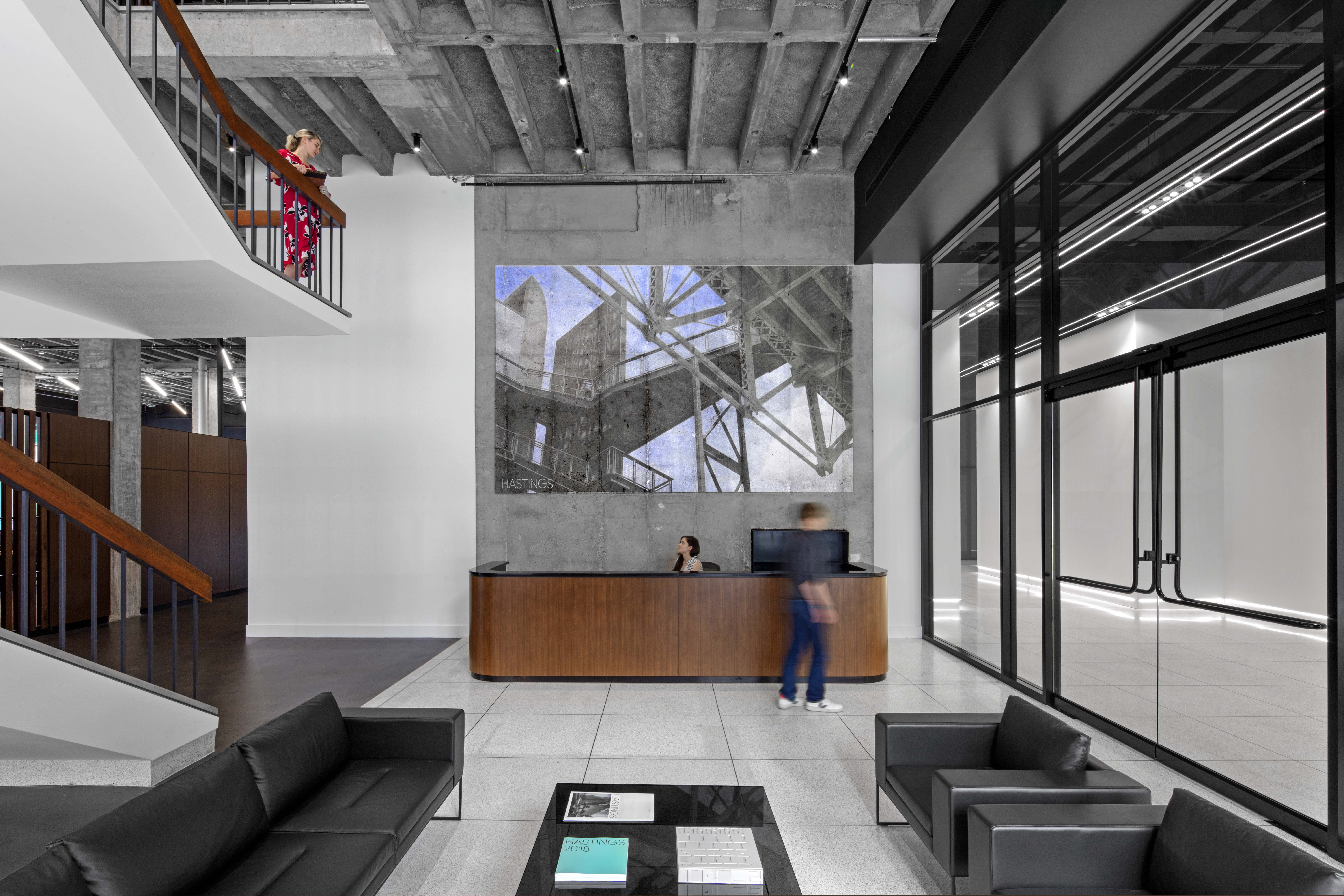
HASTINGS Architecture of Nashville, TN has given the city's iconic and beloved library new life as a creative workspace.
225 Polk was originally the site of the Carnegie Library of Nashville, which opened in 1904 and was torn down in the early 1960s to make way for the building still standing there today. Designed by noted local architect Bruce Crabtree and completed in 1965, the building remained the home of the main branch of the library until 2001 when the library moved about a block away to a new building designed by Robert A.M. Stern.
The building on Polk Avenue sat vacant for years, apart from a brief period when it housed the mayor’s and city council members’ offices, until 2017 when Powell, who, along with his partners David Bailey and William Hastings, purchased the building. HASTINGS saw in the library building a chance to revitalize an important historic landmark and the opportunity to create a striking space for its growing firm at the same time (read more about the project here).
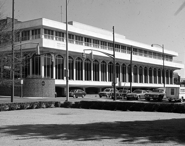
As architects who were not new to the concept of adaptive reuse, having recently completed a project transforming a historic Tennessee central train shed into offices for advertising agency The Buntin Group, the partners expected some surprises with the project. While the city had remediated the structure for hazardous materials during the mayor’s short tenancy, nothing else had really been done to the building since the 1960s.
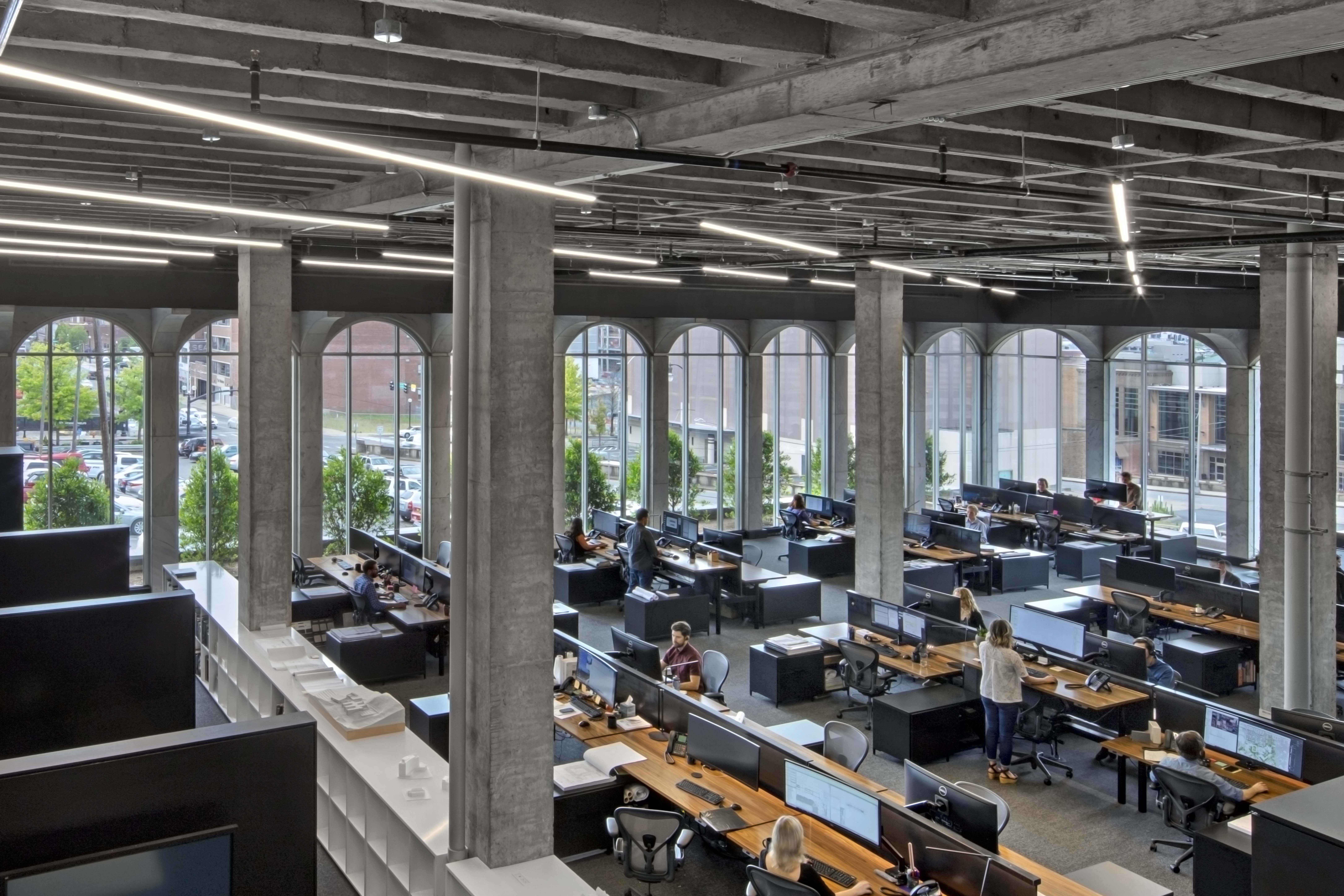
The building on Polk Avenue sat vacant for years. Now it's home to HASTING’s 75 employees.
Today the 44,000-square-foot New-Formalist landmark is home to HASTING’s 75 employees—including 43 LEED-accredited professionals—as well as to United Talent Agency and residential architecture and interior design firm McAlpine. Since the beginning, the two-story building has been defined by its long colonnades of 16’ tall glass arched windows and wall panels clad in GEORGIA MARBLE – WHITE CHEROKEE™. And maintaining and improving that exterior was integral to HASTING’s goals.
“The theme of the exterior was all about restoration,” said Powell. “It was trying to bring the facade back to the original state and original intent.”

The two-story building has been defined by its long colonnades of glass arched windows and wall panels clad in Georgia Marble - White Cherokee™.
Unprecedented change best describes the field of building in the mid twentieth century. New theory and experimentation was supported by the advancements of industrialization, resulting in innovations being encouraged and even more quickly implemented to keep up with market demands. The building industry of old and new were competing with one another, and the collaboration between the architect and the engineer became less frequent.
Even though the building industry produced some of their most progressive projects during this time, it is the evolution of the building materials and systems that enabled the field to change - enter the composite cladding materials category, and specifically the development of stone veneer-faced precast concrete panels, which was then still in its infancy.
LEARN MORE ABOUT MODERN STONE FACADE SYSTEMS
Because the system is based on different materials with their own sets of performance standards, both the stone and precast industries produced their own literature that best represented their respective industry’s position at that time.
There was some disagreement on certain topics, such as the use of bonding agents versus bond breakers, to attach the stone to the concrete. These writings started off as independent sources, but by the early 1980’s they began to complement and reference one another in their own literature. The stone industry produced some of the first literature relevant to thin stone veneer as a stand alone material in the late 1940’s. The precast concrete industry did not release an official handbook that addresses stone veneer finishes until the mid 1970’s.
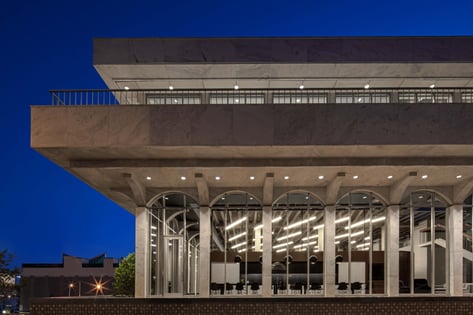
The shift from bonding the stone directly to precast concrete to instead include a bond breaker, is one of the most important developments in thin stone veneer facade designs. Moisture effecting the concrete substrate transferred through to the stone panel surface at 225 Polk, showing the importance of including moisture and thermal control layers (such as those found in rain screens) into a facade specification.
“We knew that there would be a pretty big lift with the marble, but I would have to say it was probably the one area that was the most unexpected, in terms of it being more than what we thought we were getting into,” said Powell. “And that's mainly because of the first floor columns.”
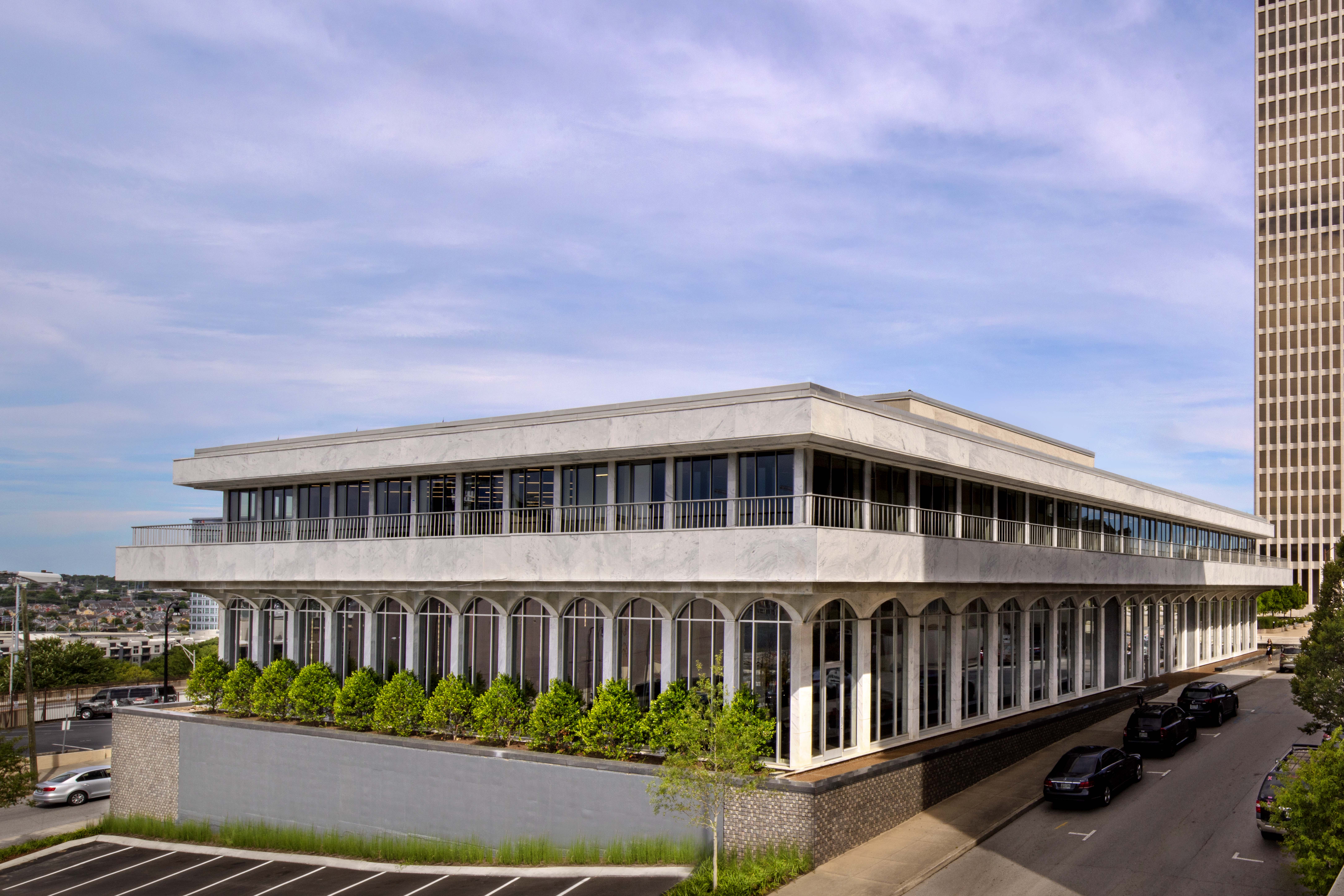
The building's previous panels were replaced by Georgia Marble™ from the same Polycor quarry in Tate, GA as the originals installed in 1965 for a seamless match
The marble panels on the bottom of the columns around the building had bowed over the years from concrete movement underneath, coupled with the weight of the panels above and the lack of proper anchoring. The original installation method of adhering the veneer to the precast concrete meant that when the bottom panels were removed, the panels above detached as well.
“So we had to replace a lot more than we thought we were going to simply by the nature of how these were put up in the first place,” said Powell.
These previous panels were replaced by Georgia Marble™ from the same Polycor quarry in Tate, Georgia as the originals, and are now ¾” thick and supported by stainless-steel clips. The panels that did not require replacement were cleaned and restored to provide a seamless transition between old and new.
“I don't know what we would have done had we not found the original quarry,” said Powell. “I think we were just so optimistic that we'd be able to find some solution that would work. But we were very thankful to find that original quarry, especially given the number of panels that we needed to replace.”
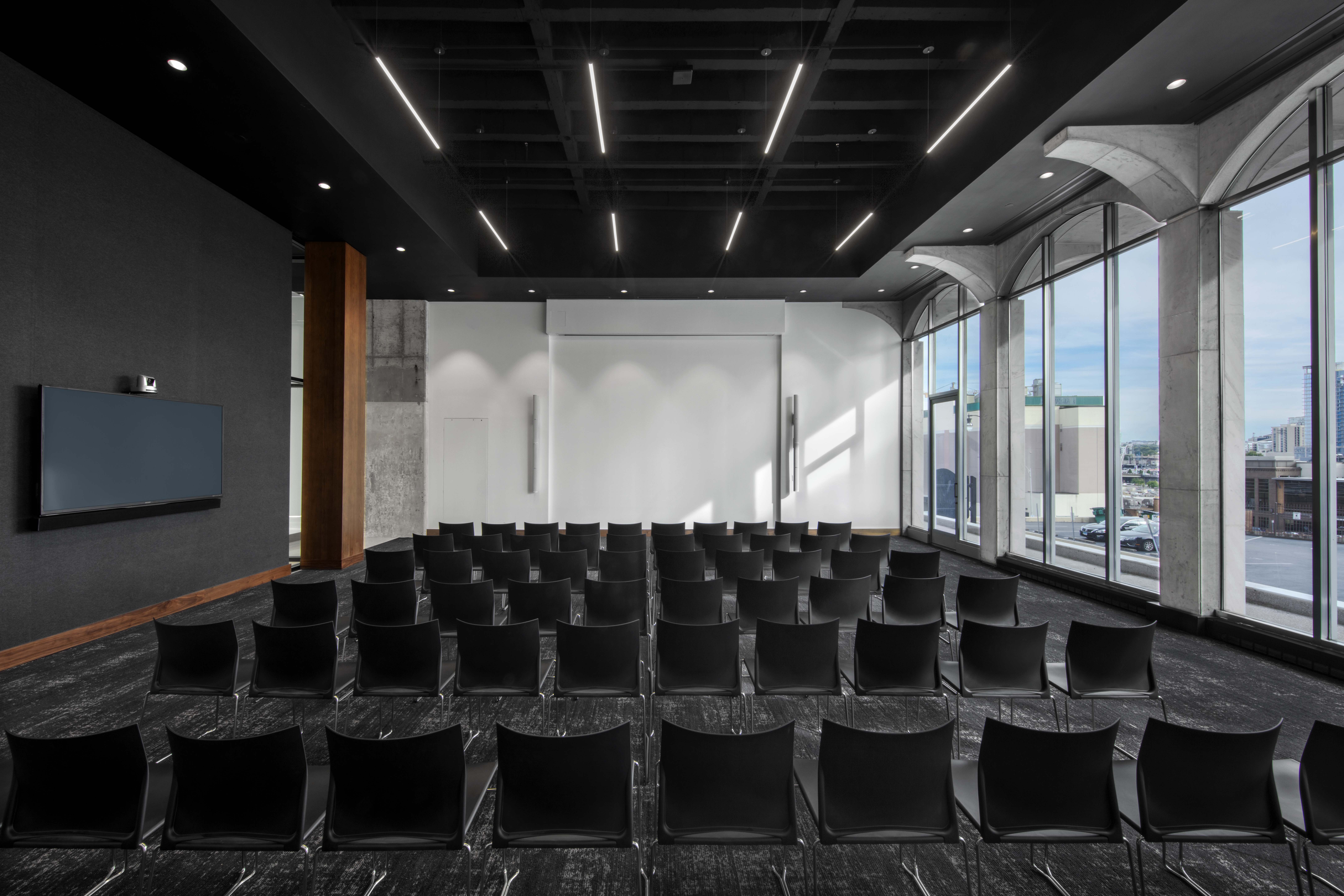
The building’s hilltop location provides full access to panoramic views over Nashville.
The arching windows that wrap around the building were another of the project’s biggest challenges, as window openings along the southern facade originally contained precast concrete infill panels to obscure the Shady Lady, a nearby nightclub, from view of library visitors. The HASTINGS team wanted to replace the infill panels with the same clear double-glazed high-performance, environmentally-friendly glass they were using in the rest of the exterior, but the landmarks committee was hesitant to allow this change to the historic building.
“We were able to get the original drawings, and we found a few details and notes that explained how the precast panels were to be installed,” said Powell. “And it's a little bit unusual for an architecture plan to actually have assembly instructions. When we looked closer, it detailed how to remove the precast panels and how it was designed very intentionally to be used to install the same curtain wall system.”
That detail was enough for the city to agree that replacing the panels with glass was complying with the original architects’ design intent. Now the building’s hilltop location finally provides full access to panoramic views over Nashville.
While the concept for the exterior was all about restoration, the interior was primarily focused on removing all of the debris and the infrastructure which had not been updated in all of the decades since construction.
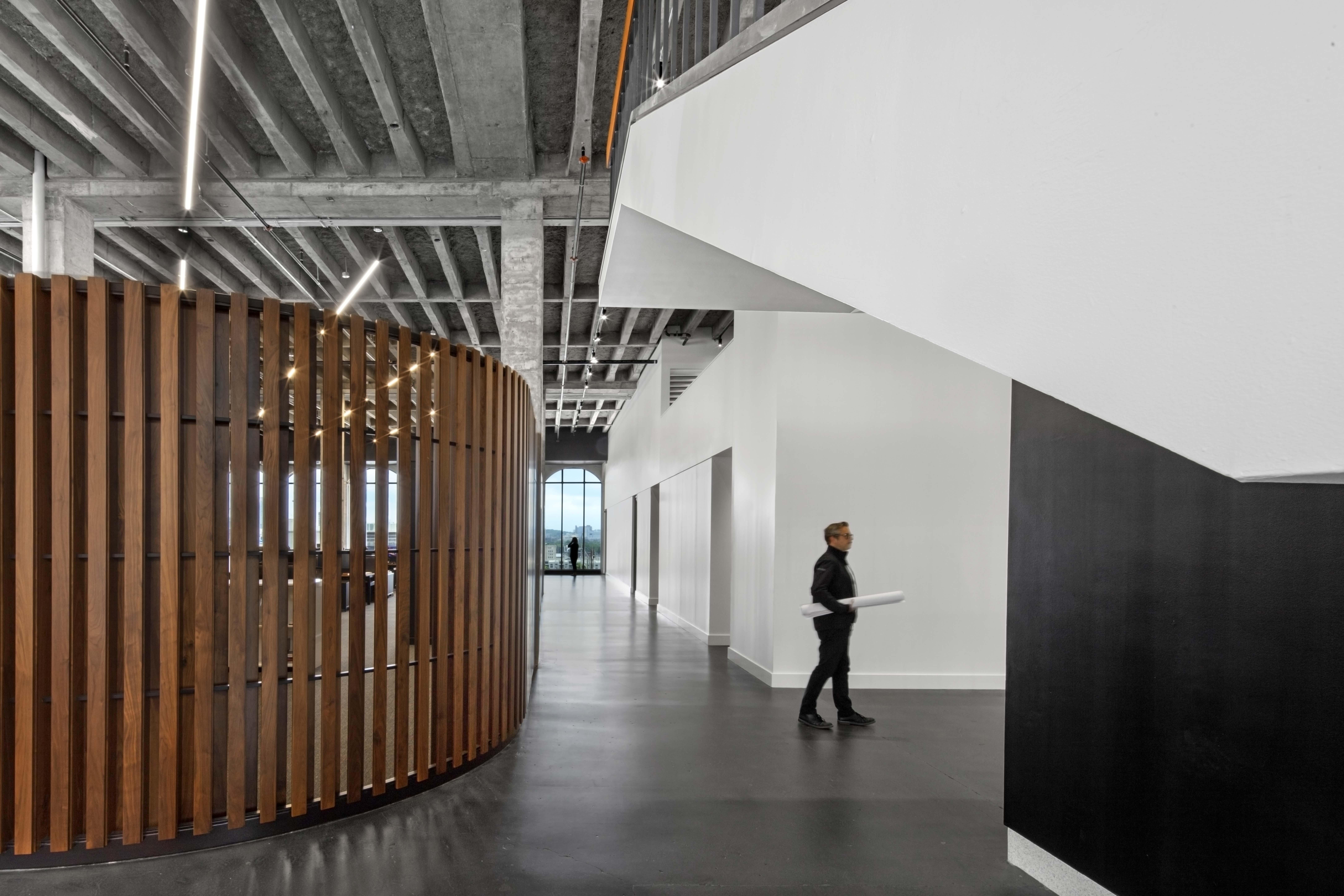
Exposed concrete columns, shear walls and waffle slab floor and ceiling components celebrate the original architecture of the library.
“The interior was all about celebrating the original architecture in a very different way, in a little bit more of an architect's way,” said Powell. “We stripped everything down to its rawest form and tried to put it back as little as possible. To impose the new design in a way that was respectful to the original design.”
In renovating the interior, they took the structure down to its skeleton, exposing concrete columns, shear walls and waffle slab flooring and ceiling components. The original terrazzo lobby floor was extended and refinished, as was the terrazzo-clad monumental stair connecting the two main floors.
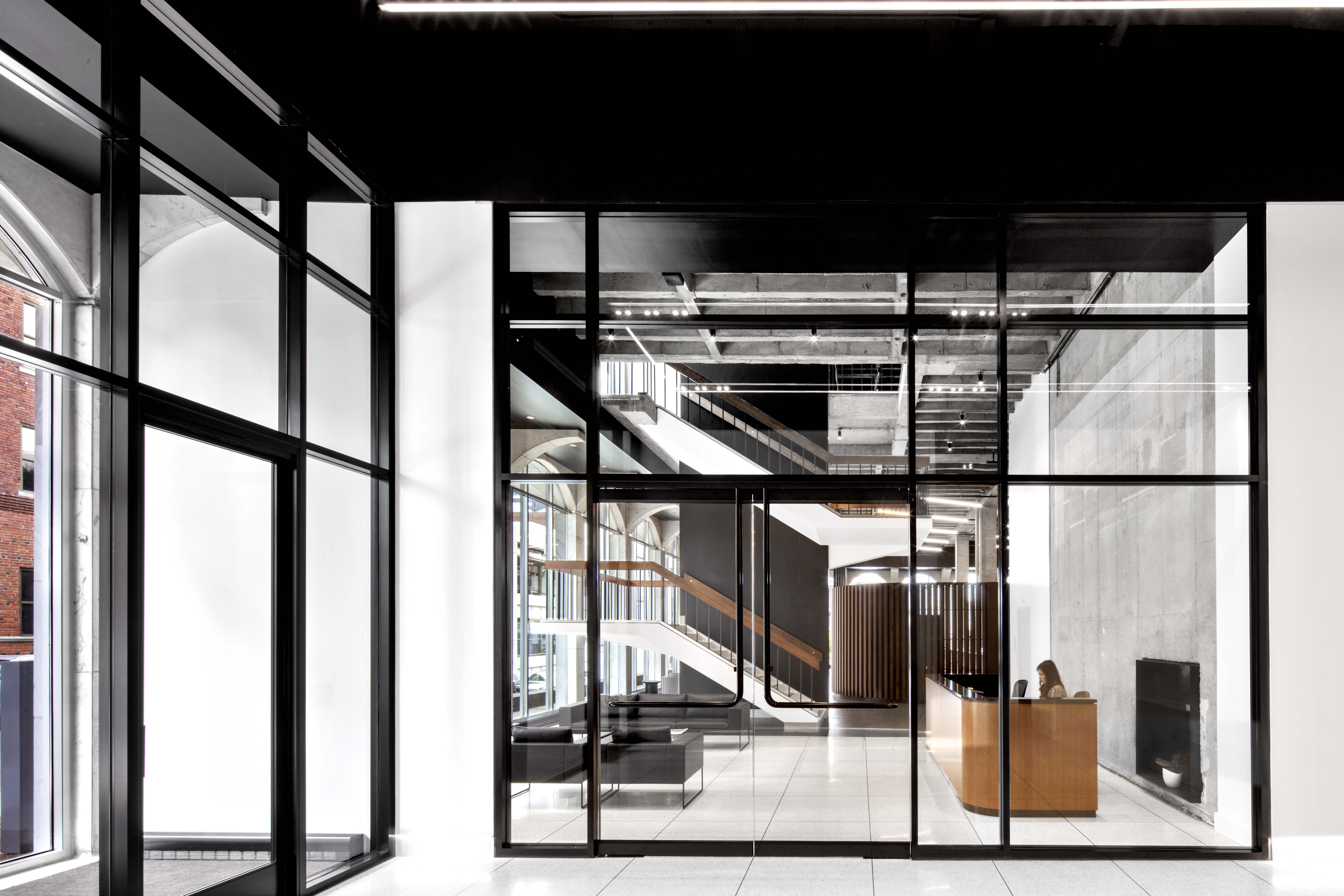
The building's color palette of black and white is partially based on a tongue-in-cheek nod to books and the building’s original intent.
That stripped down, minimalist approach informed the color and material choices for the firm’s part of the building: everything is black and white, partially based on a tongue-in-cheek nod to books and the building’s original purpose.
“It also fit very nicely with the concept — we didn't want to bring a lot of color or splash into the space,” said Powell. “We really wanted the original space to be the star of the show.”
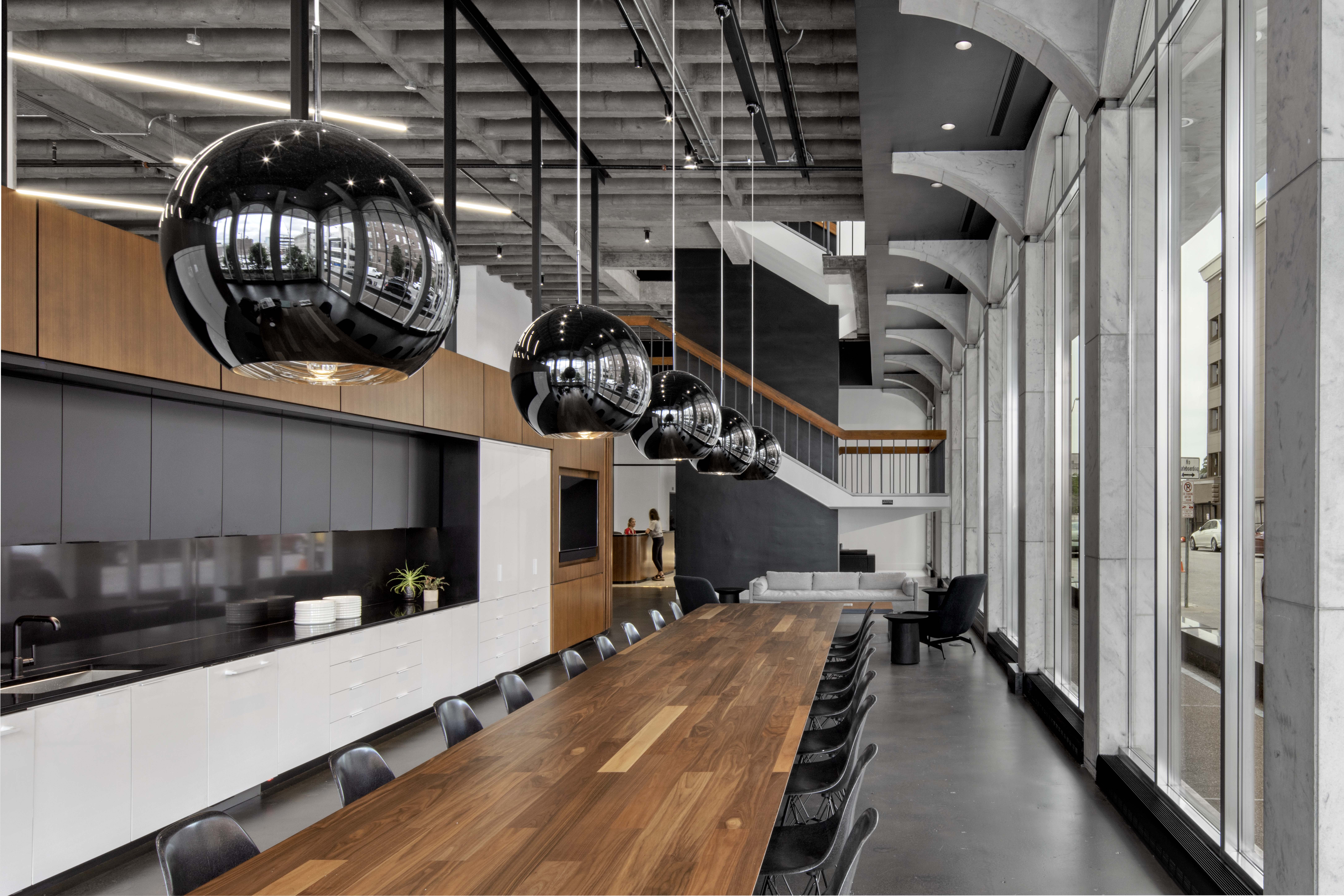
Original doors have been repurposed into countertops and tabletops, and original wood wall paneling was reclaimed and applied to columns.
Along the same lines, the overhead lighting is intentionally very linear, following the same diagonal of the book stacks from the previous layout of the library. Some of the original doors have been repurposed into countertops and tabletops, and original wood wall paneling was reclaimed and applied to columns. Throughout the space, everything is either black, white, concrete or walnut.
“Walnut became an important theme, which we thought was very appropriate for a library because there's a bit of a stately, classic feel to a wood library table,” said Powell.
The studio, an open office space, features a Knoll furniture system of sit/stand wood-topped desks paired with custom-designed divider panels comprised of hot rolled steel with caps and indirect LED lights.
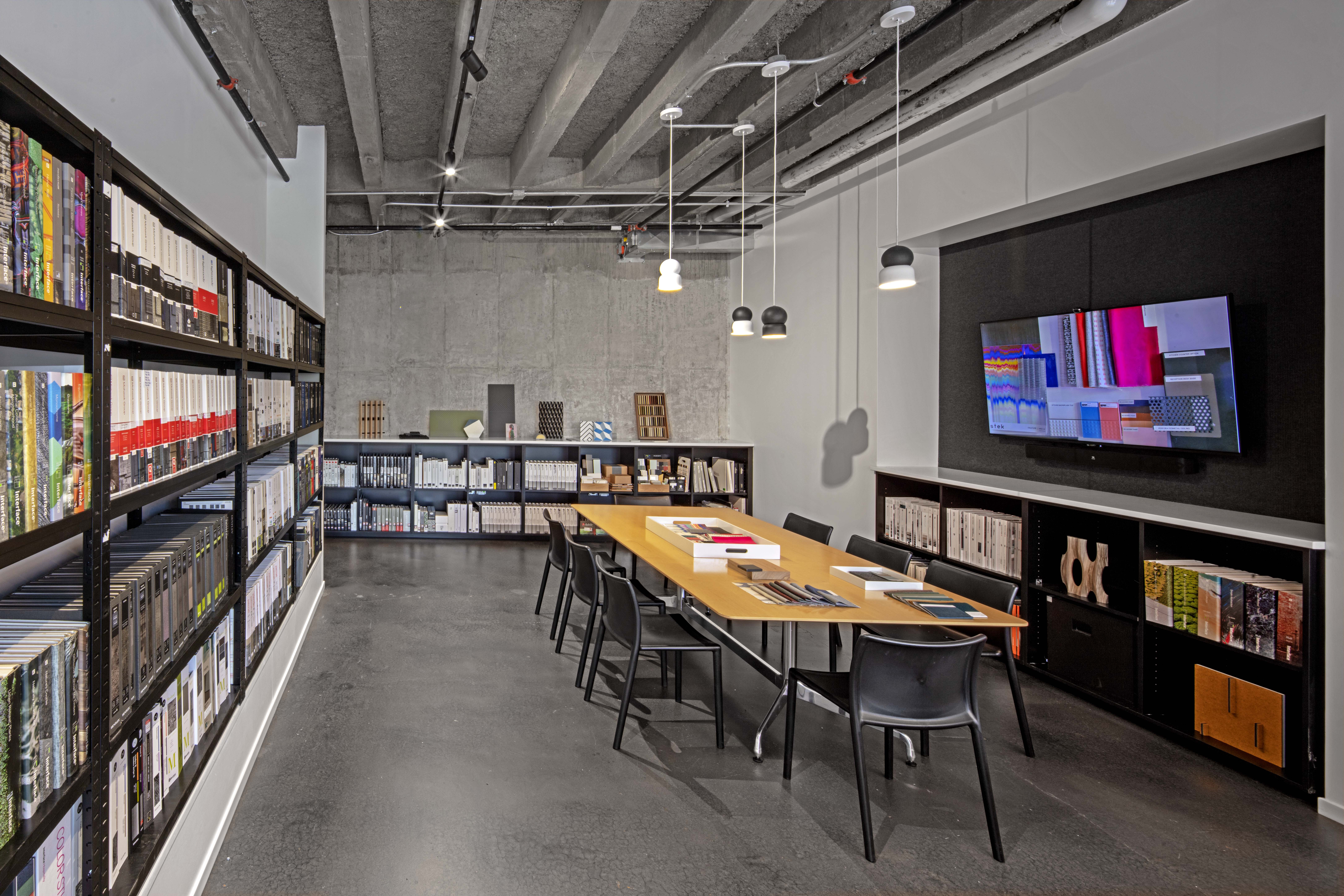
The overhead lighting is intentionally very linear, following the same diagonal of the book stacks from the original layout of the library
“We’re architects and couldn't help ourselves,” said Powell of the divider panels with a laugh.
Private phone rooms, conference rooms and an oversized café complete the space.
“It was very important to us to have a great space for our staff, and that they're not tucked away in some small break room but they're essentially on display because it's telling everyone passing by on the street that our people are the most important asset that we have here,” said Powell.
Beyond their firms’ offices, the architects reconfigured the floor plan to create a central lobby, the firm’s 24,000 square foot office, two tenant spaces, one on the top floor, and one on the north side of the building and a 1,500-square-foot community room called the Athenaeum. The Athenaeum captures the spirit of the library’s auditorium, a beloved space that primarily was used for children’s programs, while being relocated from the second floor to the main floor right off of the lobby.
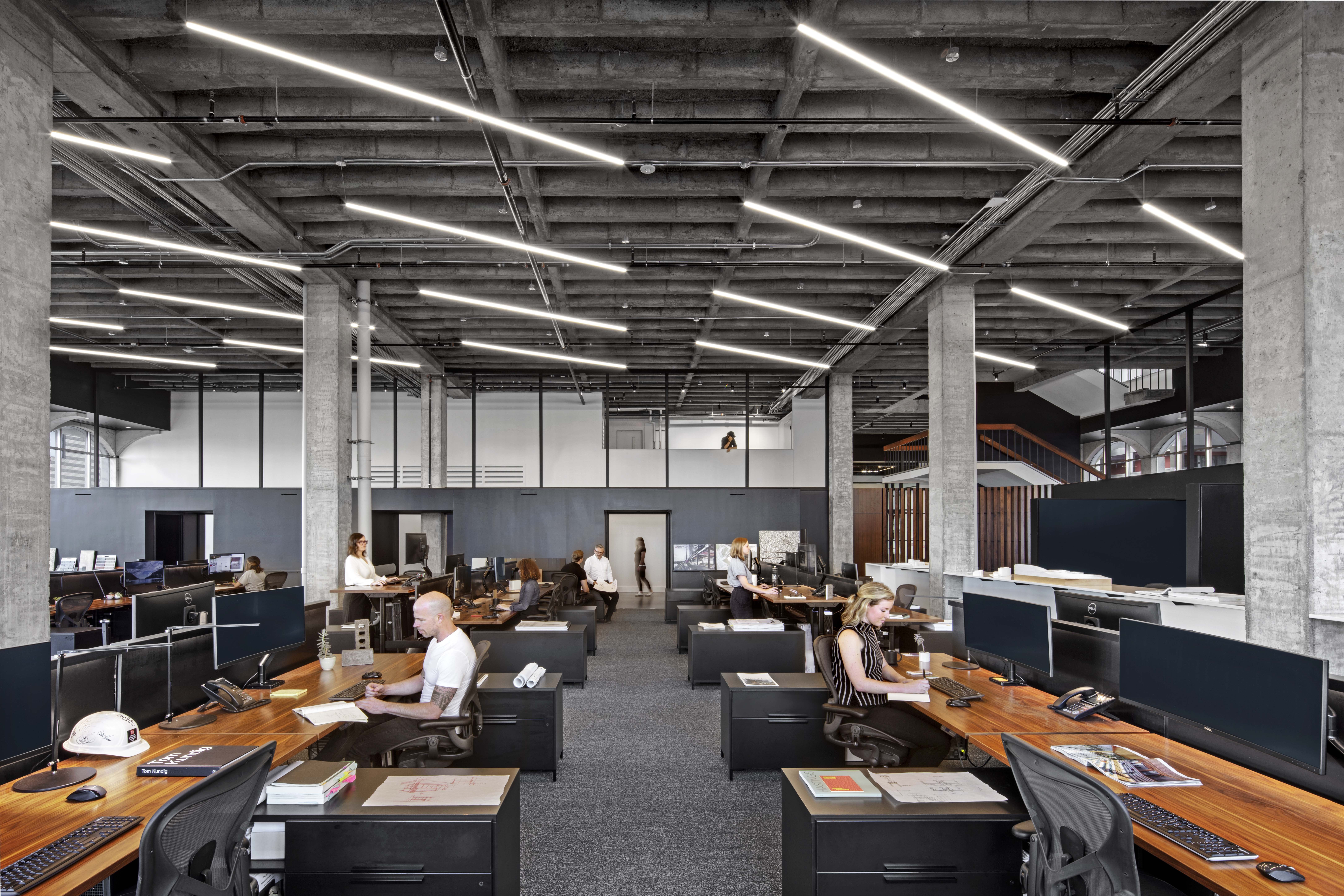 The Athenaeum captures the spirit of the library’s auditorium.
The room is technically a HASTINGS space, but they were very intentional about making sure it was not accessed through their spaces.
“The Athenaeum was sort of our acknowledgement that this had been a community building for so long — we wanted to give back to the community,” said Powell.
People and community are always top of mind for a HASTINGS project. Whether they are working on an adaptive reuse or new building, careful consideration is given to how it contributes to the greater good in the community, how it fits into the urban fabric, and how to be as progressive as possible without losing the city’s history and heritage. This is especially true when they are working in their native Nashville.
“Nashville has been so hot now for close to a decade,” said Powell. “So there's been a big influx of outside influence, outside developers and architects and contractors doing work. And inevitably that brings less sensitivity to the local community.”
“We’re very sensitive to this. We find it’s part of our charge, this role, to do what we can to preserve as many of these buildings as we can.”
See how architects are using American marble for hotels, monuments, museums, corporate buildings and historical landmarks around the world. Download the Architectural Marble Lookbook.
Photography: Eric Laignel
