In architecture, as in art, there’s a long history of traditional design styles adhering to their own sets of principles and there are those who still study them to inform their own work, sometimes incorporating elements from a variety of styles that span different eras.
“There’s a lot of subcultures in the design community,” says real estate developer Stephen Riley. “A lot of architectural teaching is very theoretical based but at some schools donors are making it a requirement to hire professionals to teach traditional design principles and skills, like hand rendering.” (In an age dominated by BIM and Auto CAD you still a need to learn to drive a stick before moving to an automatic transmission.)
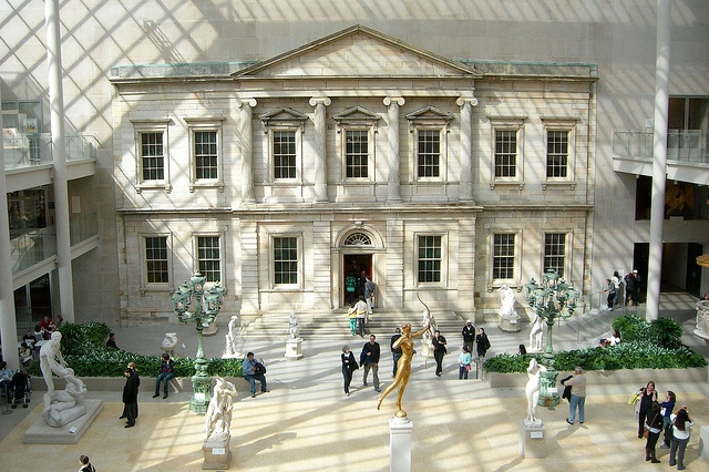
I talked with Riley recently about his work, and also that of his family before him, both of which involve a tension between classical and modern elements. We also discussed the value of great materials like natural stone to elevate a design. Riley's uncle, for example, received a Beaux-Arts education where architecture was treated as an art and worked with famed newfuturist architect Eero Saarinen. He worked as a project architect for four years on the American Wing addition at the Metropolitan Museum of Art in New York City.
The addition itself raised big issues and debates at the time, especially on how to integrate the old with the new. In classical schools of thought it would be argued that you would never put an addition onto a building like the Met, but instead he and his team found ways to integrate the two by using new technologies while maintaining original proportions and methods.
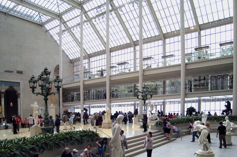
Metroplitan Museum of Art American Wing
That philosophy of work continues today. With such a vast stockpile of architectural styles to reference, some innovative architectural firms aren’t turning their backs on the past but are instead using bits and pieces of various elements together to create specific experiences.
“There’s a general change of spirit in what people are looking for in design,” Riley says. "They aren’t looking for trends but an objective quality.” It’s not just about good design either, but also about the use of sound and appropriate materials and whether it demonstrates solid workmanship, efficiency, and suitability of purpose. Natural materials like wood and stone are finding their place again in this objective quality.
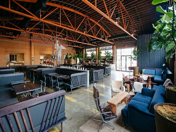
5th & Taylor Restaurant, Nashville, TN (Image Courtesy of Style Blueprint)
Whether it's classical, traditional, modern, postmodern, contemporary or conceptual, natural stone brings with it connotations of ancient cultures and experiences, steeped in history and tradition. But it’s also breaking out of it’s classical mold and being cast in a new light through the exploration of a new architectural language and the use of new technology paired with elements of traditional techniques. In our talk Riley shared with me five natural stone projects that reinterpret the classics with their integration of traditional design elements and materials:
5th & Taylor Restaurant - Smith Gee Studio
When the abandoned 98 year old textile and cotton mill factory in Nashville, TN was earmarked for demolition, Chef Daniel Lindley had visions of preserving it’s architectural heritage and giving it a new life. He started by sketching his ideas on how he envisioned converting the masonry and barrel tile roofed warehouse into a new fine dining experience for local foodies. Acccording to Nasville Scene, the five-time James Beard nominated chef “turned to Smith Gee architectural studio to convert his cocktail napkins and back of menu sketches into real plans for the dramatic space.”
 Alberene Soapstone at 5th & Taylor
His devotion to seasonal and regional foods extended to his use of American made stone in the design. The Alberene Soapstone counters and bars sourced from the 133 year old Polycor Virginia quarry were used throughout the space adding to the industrial feel and keeping with the southern tradition.
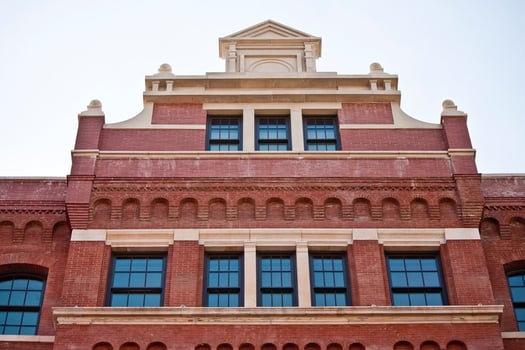
Queen Anne-Style Pediment at the Schumacher Building NY
Shumacher Building - Morris Adjmi Architects
Sitting in disrepair and dilapidated from years of neglect, a former 19th century printing plant was sighted for redevelopment into luxury apartments on Bleeker Street in New York City. Real estate developer and art gallery curator, Cristina Grajales, saw it as a work of art needing some restoration work and called on Morris Adjmi Architects to create the design.
“I’m confident we are creating something of artistic significance, and I’m not surprised certain people get it,” says developer Roy Stillman, who has worked with the infamous architect I.M. Pei and other visionaries. (Gina Pace, NY Daily News).
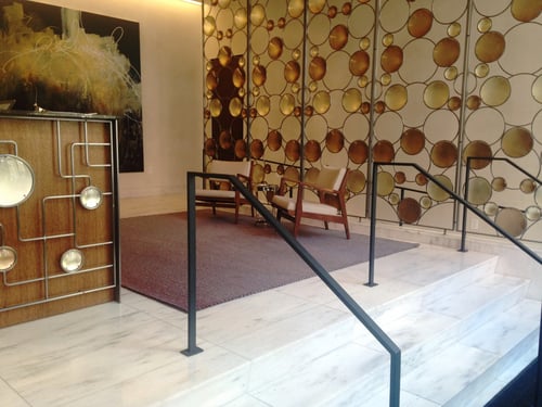
White Cherokee Marble Flooring at the Schumacher
Polycor’s US marble, White Cherokee from their Georgia quarry, was used for the lobby flooring and reception area. Using the same marble that built much of the original New York architecture was the right choice to maintain the history of the original building. Like Riley says, “many people are looking to capture a certain nostalgia”.

I.M. Pei's Gulf Oil Building (Image Courtesy of Curbed NY)
131 Ponce Apartments, Gulf Oil Building
The Charlotte, NC, development firm, Faison, faced a design challenge when they were looking to build multi-unit residential apartments in Atlanta. The original Mies van der Rohe style building on the site they chose was the first realized architectural work by I.M. Pei, the famed architect who would later go on to design the glass dome on top of the Louvre, the east wing addition to the National Gallery of Art, the JFK Library in D.C. and the Jacob Javitz Center in NYC.
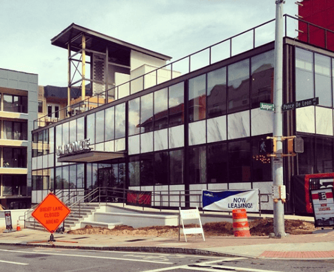
White Cheorkee Georgia marble panels preserved during addition of 131 Ponce
Known as the Gulf Oil Building, the steel and glass rectilinear box was originally built in 1949 with panels of White Cherokee Georgia marble set into a skeletal framework. Blending traditional architectural elements with progressive designs based on simple geometric patterns, Pei has been described as combining a classical sense of form with a contemporary mastery of method. Faison resurrected a portion of the shell of the original building and incorporated it into the new complex, maintaining the design of structure and the original US marble panels used from the local Tate marble quarry.
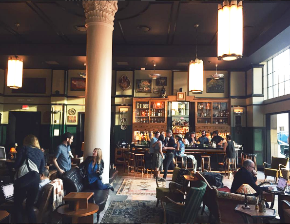
Ace Hotel, NOLA - Roman & Williams
Hailing from a set design background, the principals at NY based firm Roman and Williams are true draftsman, having created mood and atmosphere for movie sets like Zoolander and Gattaca and interiors for celebrities like Gwyneth Paltrow. Like their mission states: “First and foremost, we’re focused on people and their experiences of a space… we’re known for our contradictions, taking a traditional foundation and then rebelling against it with lively irreverence.”
Devoted to protesting against disposability and the common stereotypes of what it means to be modern today, Roman Williams combine a wide array of historic architectural elements and materials like stone and wood in the most surprising ways. The Ace Hotel is a token example of their mixing of styles, preserving existing columns, mouldings and trim details while bringing in custom designed and fabricated furniture and finishes. Built in a limestone clad 1928 Art Deco building in the heart of the Warehouse district of New Orleans, they have embraced the culture and roots of the city’s past with eye catching and vintage interiors seamlessly integrated it into the present. In an interview with The New York Times, Robin Standefer, co-partner of the design firm Roman and Williams, said that the hotel is an attempt by the hoteliers to move “beyond just making a living room — and into the territory of cultivating a community.”
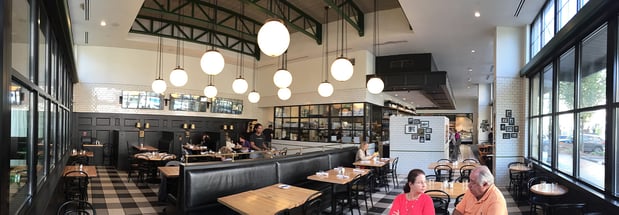
The General Muir (Image Courtesy of Atlanta Food Critic)
General Muir Deli - Sq Ft Studio
Looking to create a specific environment and classic NY dining experience, local Atlanta firm, Sq Ft Studio found inspiration for this modern delicatessen from a black-and-white photograph of their client’s mother on the deck of a Holocaust survivor transport ship called The General Muir.
Its destination, New York City, provided a framework for their design, through its authentic delis and industrial details. "This was a chance to be creative again, to dream up something different and new," says Johnson. Employing a material like White Georgia marble for the huge bar tops contributed to that experience of history. The story of this classic US marble goes back over 150 years to when it was first discovered in the rolling hills north of Atlanta. Paired with the black painted millwork, white subway tile and brass railings it’s a true study in American vernacular design.
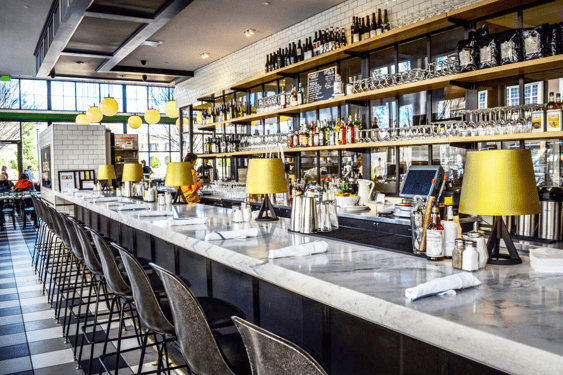
Pearl Grey marble from the local Georgia Marble quarry covers the bar at General Muir
As Riley says, “Integrity of material is important.” “Stone has a new opportunity as a material beyond a flat slab panel on a façade,” Riley stated. “With parametric design in BIM there’s new ways to use stone efficiently”. And Polycor's N. American stones and US marble products are no exception, having a long history of notable projects completed across the world.
With developments like our Ultra Thin stone slabs that are a mere 3/8” thick for example, this typically heavy and cumbersome material is now places it’s never gone before, like full walls and floors (even on ships and high rises). It’s also giving companies with a traditional design aesthetic the ability to showcase their more modern products in a classical material with a modern look. You can see one example here in our case study of the Baccarat flagship store on Madison Avenue.
