For the edgiest of designers the white kitchen is on its way out.
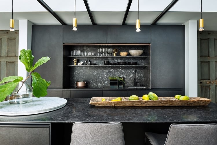
Not one to shy away from making bold statements, Aimee Wertepny, of the Chicago-based design firm, Project Interiors, is exactly that. For Wertepny, SAINT HENRY BLACK ™ granite, with it's mega crystal character, was the stone choice for the fashion-forward kitchen of her firm's flagship office.
 Chris Bradly Photography
“First of all we wanted a black box — literally black box — something that was very architectural and that stone had been one of my favorites for years because I love the texture and the quartz. It’s definitely a step up from other black stones”, said Wertepny, “but I also felt it had a blackened steel quality to it, being that thin. We wanted all the components to work together in harmony but didn’t want the countertop or cabinets to steal the show. Even though it’s black on black, they all really tie into together”, stated the designer.
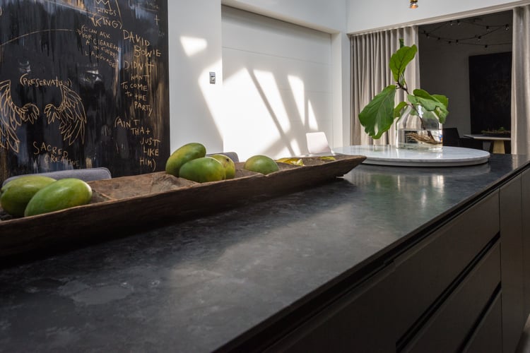
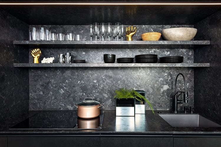
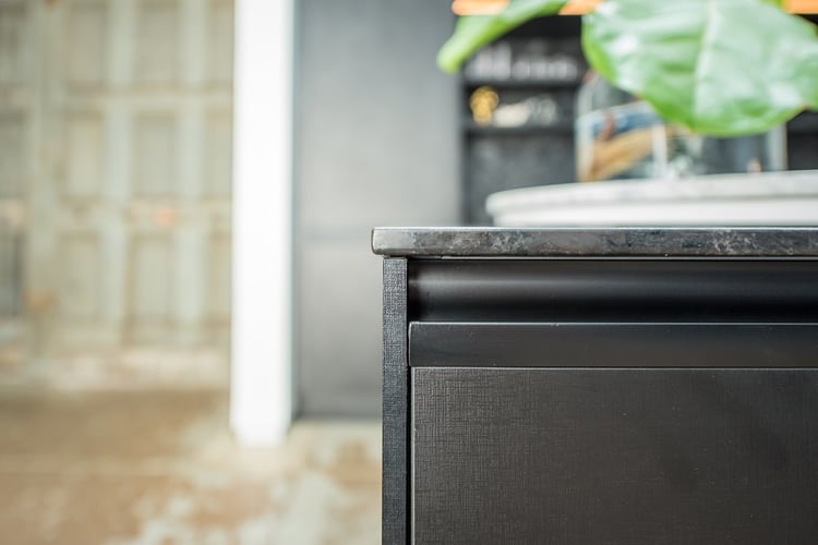
In order to create a seamless and fluid appearance between the black stone and black cabinetry, and to achieve a homogenous, built-in look, the designer used a Saint Henry Black veneer. Wertepny worked in collaboration with cabinet designer, Florense, who kept a slim silhouette by encasing the side panels, countertop, soffit, shelves and backsplash all in 1 cm thick slabs of Saint Henry Black granite in an antiqued finish. This finish is also know as brushed and leathered for it's touchable quality.
 Chris Bradly Photography
Technically speaking, the slabs are sliced down to a third of the thickness of a traditional slab (that's thinner than an iPad) and backed with a carbon fiber blend mesh for 10 times the flexural strength. The ultra-strong, ultra-thin material is easy for fabricators to work with for cabinetry and shelving, much like a carpenter uses wood.
Since the designer insisted on maintaining its thinness, the entire kitchen successfully appears as an integrated unit — not one part of it seeming out of place or coming off as an afterthought.
 Chris Bradly Photography
“We like to push boundaries”, laughed Wertepny, “it’s been really interesting to see the trends go towards thinner surfaces — it hasn’t been an easy sell to some of our clients. They might see it as a value issue but at the end of the day, it’s stone and it’s beautiful, regardless of the thickness. It’s certainly not a standard element that builders are building condominiums with, so, I feel like it’s very customized, it’s very sleek and very much more in the direction of European kitchen design”
And push boundaries they did, as Wertepny explains, even the kitchen fixtures were custom-made to reflect Project Interior’s edgy and fashion-forward aesthetic. Thanks to the luxury faucet brand, Brizo, who gifted them a signature matte black faucet specially made by fashion designer Jason Wu, they’ve been able to pair style with sustainability, thanks to Brizo’s commitment to water conservation.
“It’s a full working kitchen that we use everyday, [in addition to hosting] our own parties. It does serve as a really great example to our clients, so they can touch it, feel it, see how durable it has been in our kitchen. This way they can see that black box [style] doesn’t need to be scary. We have used it for show-and-tell quite a bit”, she said.
 Chris Bradly Photography
Known for its large crystal structure and luminescence, Saint Henry Black is an ideal material for kitchens because of it's marriage of durability and bold yet subtle look and feel - a little flash but never over the top. The secret behind this just-right balance of sparkle and shine is in the stone’s mega crystals. “I love that stone in particular not only because of the look, the texture and the thickness — which is really unique — but it’s also something that’s really durable and wouldn’t be too precious in our space. So, it fit the bill on all levels,” Wertepny said.
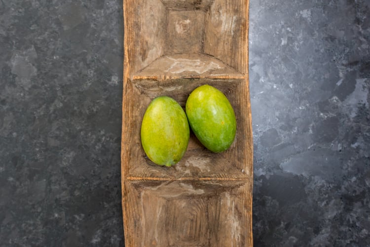
At Polycor, we call it Saint Henry Black but it’s also known as Taillon, Péribonka and Canadian Black. You’ll be able to identify this stone by it’s smooth crystalline composition and thin silvery veins that are exposed by black textured graining. It captures and throws light in a manner that’s pleasing to the eye, but not overwhelming. Walk from one end of the counter to the other and you’ll see a mini light show thanks to the varying shapes, sizes and positions of the crystals embedded deep within the stone. Because it’s a bit subdued, using a Saint Henry Black granite in the kitchen gives you that wow-factor with a slightly more relaxed aesthetic.
 Chris Bradly Photography
When working with the fabricators, Becker Works, on the project, Wertepny emphasized that customizing and working with a 1 cm veneer was tricky at times but without a doubt, so worth it. “They did such a good job”, she said,.“They basically had to wrap [the granite] around steel supports [to make] the shelving in the black box.” The amount of mitering on the shelf boxes is mesmerizingly precise with no filled chips or visible end grain and is then wrapped back underneath for a truly monolithic appearance. Equally interesting is the island design with one side boasting a mitered waterfall, wrap-down leg and the other capped with a cabinet end panel. Transitioning to a more shallow cabinet at the stone end left a hollowed out section under the countertop for comfortable seating. The backview of the 1 cm thick waterfall leg creates an eye-catching design element. Project Interiors also worked with distributor and supplier Terrazzo & Marble to complete the project.
Besides designing an office kitchen worthy of more than just a water-cooler hangout, the design firm may be one of Chicago’s coolest work spaces — literally. The all-white walls and unfinished floors of the interior compliment their black granite kitchen for a hip, industrial look that Wertepny loves enough to enter their space in running for the Chicago’s Coolest Office award, hosted annually by Chicago Business.
We may be biased, but here at Polycor the question of whether or not Project Interior will win, seems pretty black and white to us. Their innovative use of Saint Henry Black granite is proof that taking risks really pays off, says Wertepny. “From an architectural standpoint, it’s a such a clean, sleek and forward material to work with. I love to use it.”
Make durable and modern updates to any project with Saint Henry Granite. Download the spec sheet here.
